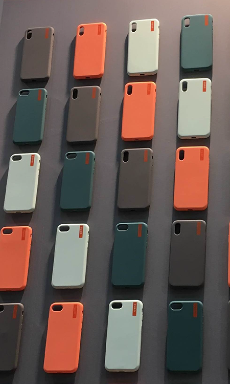
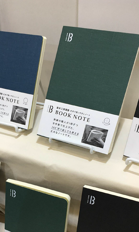
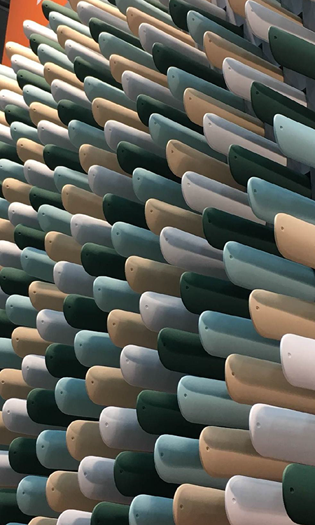
New products for the office that look like office products: this makes sense! There are some colours that we can associate to the school and the office such as the orange and blue of the eraser, the green of the chopping board, the black of the ink, the white of the paper and the warm brown of the leather of wood. This is a very honest way to belong to the stationery world.
辦公室的新品看起來就像是辦公用品:這就是意義所在!一些讓我們聯想到學校和辦公室的顏色,例如,橡皮擦的橙色和藍色,黑板的綠色,墨水的黑色,紙張的白色,皮革和木頭溫暖的棕色。這是屬于文具世界的誠實方式。
★文章來自《2019日本東京國際文具及辦公用品展分析報告》。
★點擊此處,查看更多報告詳情:http://www.27679.cn/report/37.html
與設計師合作
更多該設計師作品詳情,
(轉載請注明出自愛原物,盜版必究)
 愛原物APP


 誠實守信
誠實守信 尊重版權
尊重版權 扎實服務
扎實服務 共同分享
共同分享

 微信公眾號
微信公眾號
 新浪微博
新浪微博