ICON GROWTH: SLOTH
上升期主題:樹懶
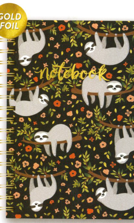
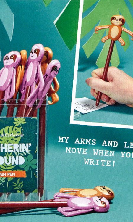
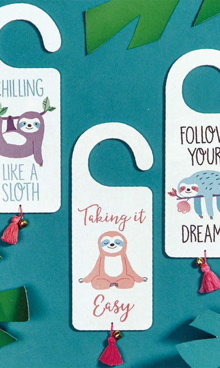
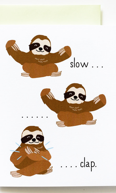
The market is always on the lookout for a new icon to make an impact and stick, and at NSS, it was clear that the Sloth is on the rise. The use of this icon was not only apparent in
children’s product, it was abundant as an audience of all ages. I think the “it’s so ugly, it’s cute” is the appeal behind this mysterious mammal. While I wouldn’t recommend creating a broad assortment using this icon, I strongly believe it should be represented in smaller, capsule collections. The palette was not far-reaching and was primarily shown as close to the color of the actual mammal itself, with the addition of greens and browns to create the surrounding natural habitat, and pops of color like orange, yellow, pink, and blue as accents for added appeal and familiarity.
Items included celebration, paper and stationery, pens, totes, pouches, and gift giving. Materials ranged from paper, wood, fabric, and canvas, to plastic.
市場總是在尋找新的主題以帶來巨大的影響,在紐約國際文具展上,樹懶明顯上升。這一主題的使用不僅僅出現在兒童產品上,極其豐富,適合所有年齡層的受眾。我認為“丑萌”是這一神秘的哺乳動物背后的吸引力。雖然我不建議使用這一主題開發廣泛的產品類別,我認為應該將其用在更小的、膠囊系列中。調色板并沒有太大的影響,主要呈現為接近現實中的哺乳動物本身的顏色,加上額外的綠色調和棕色調創造周圍的自然棲息地,使用流行顏色作為重點色,如橘色、黃色、粉色和藍色,以增加吸引力和熟悉度。
產品包括慶典用品、紙制品和文具、筆、手提包、小袋子和禮品包裝。材料范圍包括紙質、木材、織物、帆布和塑料。
★文章來自《2019紐約國際文具展分析報告》。
★點擊此處,查看更多報告詳情:http://www.27679.cn/report/29.html
與設計師合作
更多該設計師作品詳情,
(轉載請注明出自愛原物,盜版必究)
 愛原物APP


 誠實守信
誠實守信 尊重版權
尊重版權 扎實服務
扎實服務 共同分享
共同分享

 微信公眾號
微信公眾號
 新浪微博
新浪微博