ORANGE
COLOURS
The colour orange appeared everywhere at Paperworld.
The colour was so strong and striking and stood out in any display.
The colour has been used on many different products and substrates.
The colour is bright but on the earth side rather than neon.
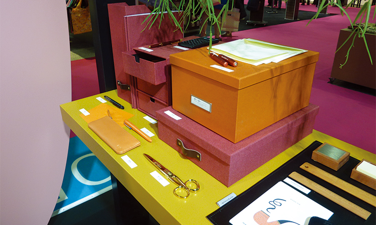
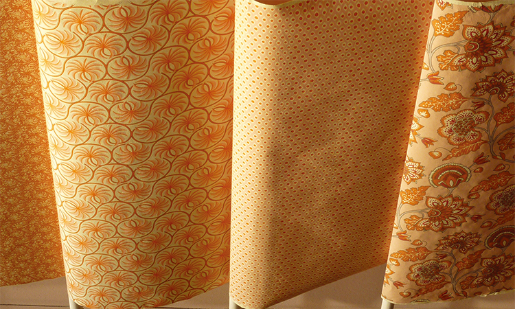
Orange has been used in many different design applications as well. It has been used on traditional patterns and acrylic edges.
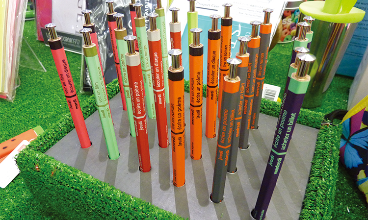
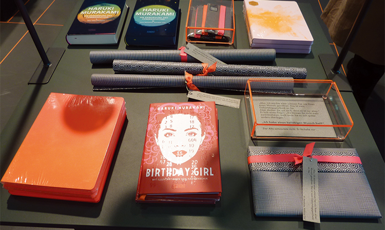
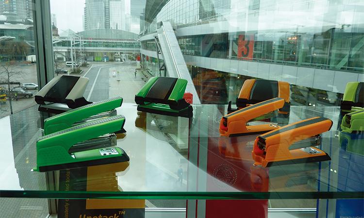
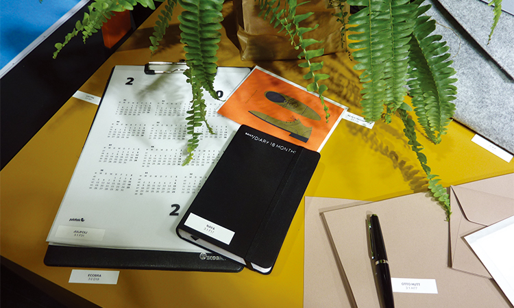
Orange is also very popular on stationery accessories.
Orange has been mixed with reds and greys but on the majority it stands alone.
橙色調(diào)
法蘭克福國際文具展上到處都是橙色。
這一顏色是如此的強勢醒目,在任一展廳上都很突出。
被用在許多不同的產(chǎn)品和基底上。
這一顏色明亮鮮艷,但是比霓虹色更加樸素。
橙色也應用在不同的設計方式上。可用在傳統(tǒng)的圖案和亞力克邊緣上。
橙色在文具配件上也很受歡迎。
可以混合紅色和灰色,但是大多數(shù)情況下,單獨使用橙色。

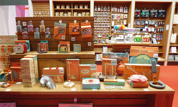
ORANGE
COLOURS
There was so much orange at Paperworld! that it was also used in displays and packaging as illustrated opposite.
Large areas of orange has been used in the design of packaging and display units.
Orange is the main colour within these designs teamed only with limited amounts of other colours.
橙色調(diào)
法蘭克福國際文具展上有如此多的橙色!也作為插畫的對比,用于陳列和包裝。
大面積的橙色被用于包裝和陳列品設計。
橙色是這些設計的主色調(diào),搭配有限的其他顏色。


★文章來自《2019德國法蘭克福國際文具展分析報告》。
★點擊此處,查看更多報告詳情:http://www.27679.cn/report/22.html
與設計師合作
更多該設計師作品詳情,
(轉(zhuǎn)載請注明出自愛原物,盜版必究)
 愛原物APP


 誠實守信
誠實守信 尊重版權(quán)
 扎實服務
扎實服務 共同分享
共同分享

 微信公眾號
微信公眾號
 新浪微博
新浪微博