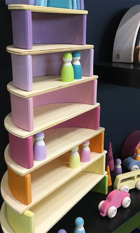
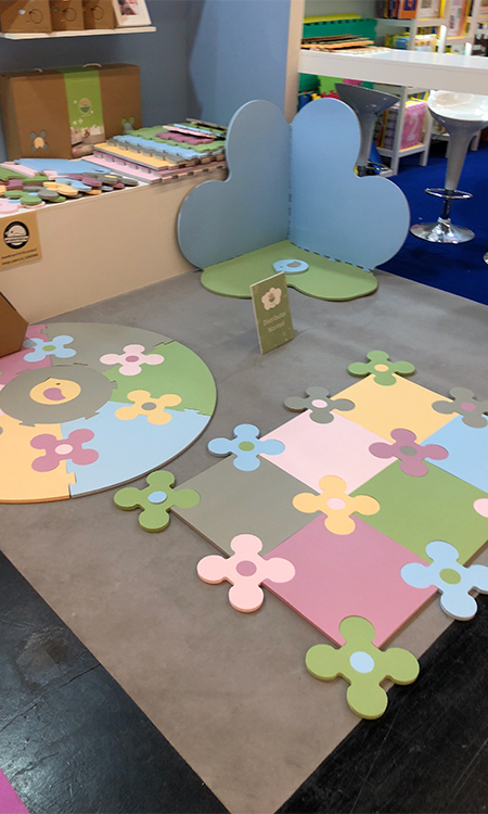
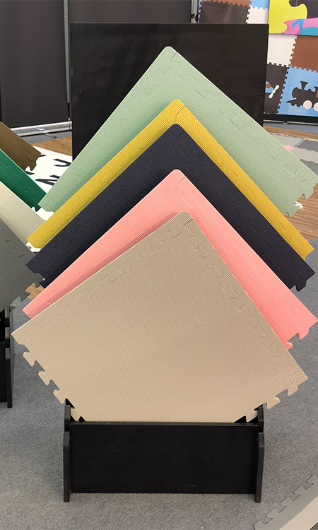
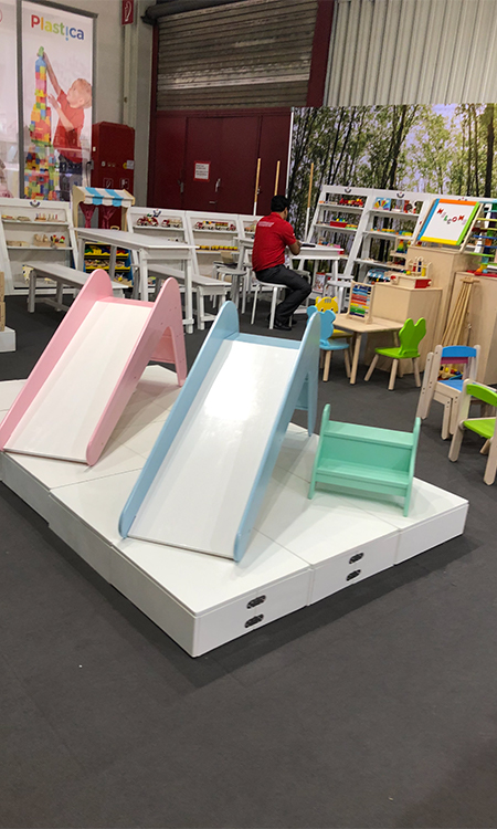
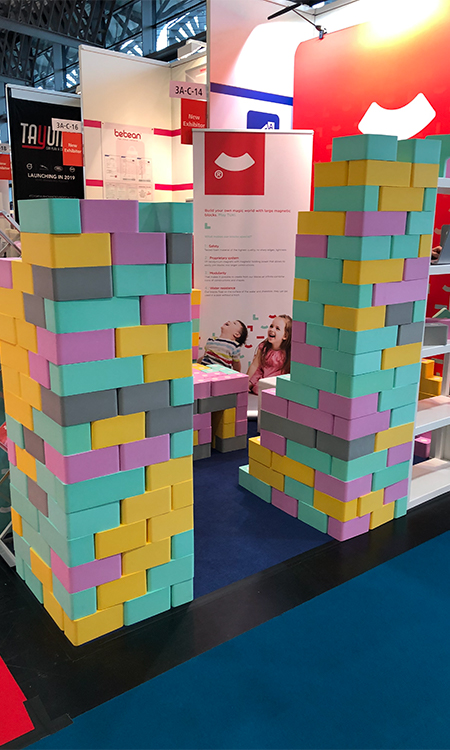
PASTELS
Over recent years, children’s design has become considerably more sophisticated, allowing children’s products to blend seamlessly into the home. Pastel shades of pale buttercup tones, paired with blush nudes and soft sage greens were seen on toys and accessories and easily integrate into white and grey based interiors, creating a sophisticated, Scandinavian-inspired aesthetic.
粉彩
最近幾年,兒童產品的設計變得更加復雜,使得兒童產品可以無縫地融入到家中。粉彩色調的淺色毛茛色調,搭配臉頰紅肉色和柔和的鼠尾草綠,出現在玩具和配件上,輕松融入白色和灰色基礎的室內空間中,創造精美的、斯堪的納維亞靈感的美感。
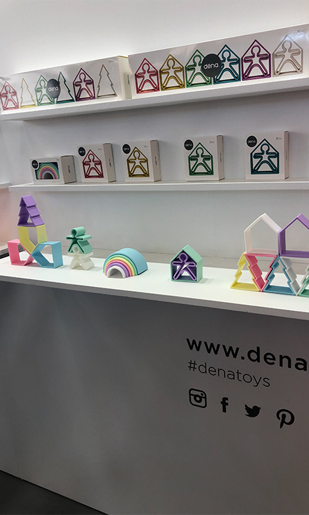
PASTELS
Dreamy pastel colours take parents back to their childhood where toy’s like My Little Pony and Barbie shared this same sugary colour palette. Pastels provide a calmness to what can often be a frantic and exciting activity, a welcome relief to parents I’m sure.
粉彩
夢幻般的粉彩色調將父母們帶回到童年,那時彩虹小馬和芭比娃娃之類的玩具都使用了同樣的糖果色調。粉彩色給那些瘋狂、令人刺激的活動帶來了冷靜感,我確信這對家長來說,是一種安慰。
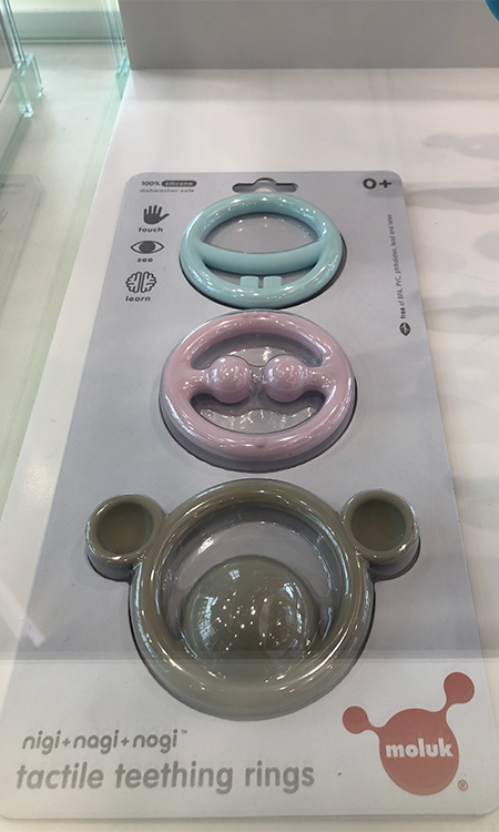
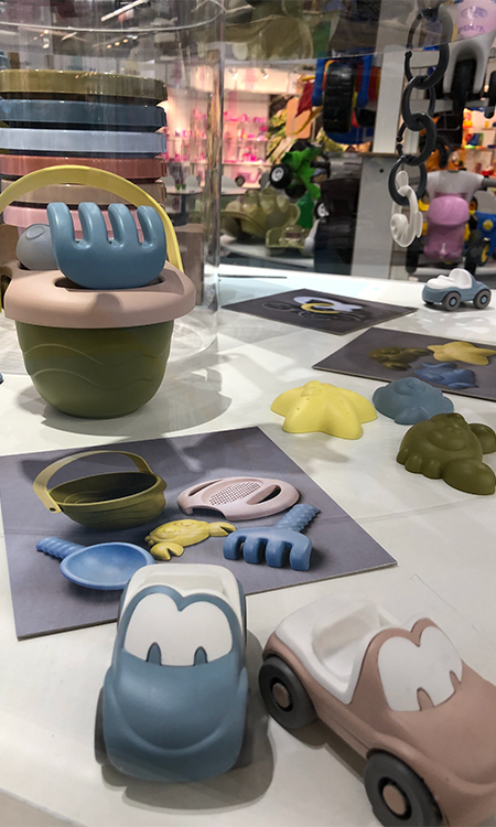
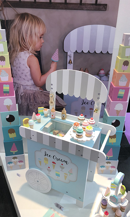
PASTELS
This colour trend has taken on all product types and ages. From baby teething toys, to role-playing food sets, to indoor and outdoor sports equipment like scooters and slides. There is
A sense of renewal and freshness to these mainstays of the toy word.
粉彩
這一顏色趨勢用在所有產品類型和年齡層上。從嬰兒磨牙玩具,到角色扮演的食物套裝,再到滑板和滑梯之類的室內和戶外運動設備。粉彩給玩具世界的主流產品帶來了更新和新奇感。
★文章來自《2019德國紐倫堡玩具展分析報告》。
★點擊此處,查看更多報告詳情:http://www.27679.cn/report/30.html
與設計師合作
更多該設計師作品詳情,
(轉載請注明出自愛原物,盜版必究)
 愛原物APP


 誠實守信
誠實守信 尊重版權
尊重版權 扎實服務
扎實服務 共同分享
共同分享

 微信公眾號
微信公眾號
 新浪微博
新浪微博