TREND INTRODUCTION: ABSTRACT
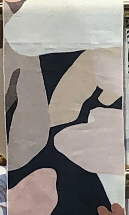
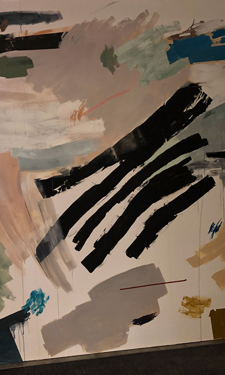
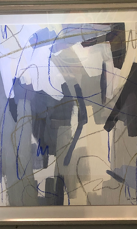
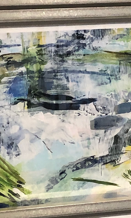
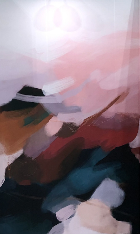
I'm beginning the trend section with Abstract because it is the newest and most widespread introduction at NSS. This trend was represented across all items including, but not limited to, stationery, gift wrap, wall art, celebration, home decor, bath & body, packaging, trinket trays, giftables, and pillows.
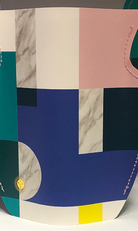
I would define the Abstract theme as non-uniform, undefined shapes.The theme was shown in a wide array of coordinating colors according to personal style. This look would also compliment a Mid-Century Modern style, which is a growing trend in the US and abroad.
I would recommend representing this trend in development collections, though depending on your customer base, I would advise making this a small, focused assortment until it catches on to a wider audience. I am in stores several times weekly and have yet to see this trend hit the stores, though I have no doubt it will make a presence soon.
萌芽期趨勢:抽象
我以抽象作為趨勢部分的開端,因為它是紐約國際文具展上最新、最廣泛的萌芽期趨勢。這一趨勢出現在所有的產品中,包括但不限于,文具、禮品包裝、墻面藝術、慶典、家居裝飾、洗浴用品、包裝、小裝飾品托盤、禮品和枕頭。
我將這一抽象主題定義為不統一的、無定義的形狀。根據個人風格,這一主題呈現為各種相互協調的顏色。這一外觀也可以襯托上世紀中期的現代風格,這一風格在美國和國外都呈現上升趨勢.
我建議在開發系列產品時應用這一趨勢,但是要根據客戶基礎,我建議推出小的、以混合產品為主的系列,直到這一趨勢獲得更加廣泛的受眾。我每周定期去商店考察,雖然我并沒有看到這一趨勢的產品在售,但我堅信這一趨勢很快會在市場上占據一席之地。


TREND INTRODUCTION: ABSTRACT
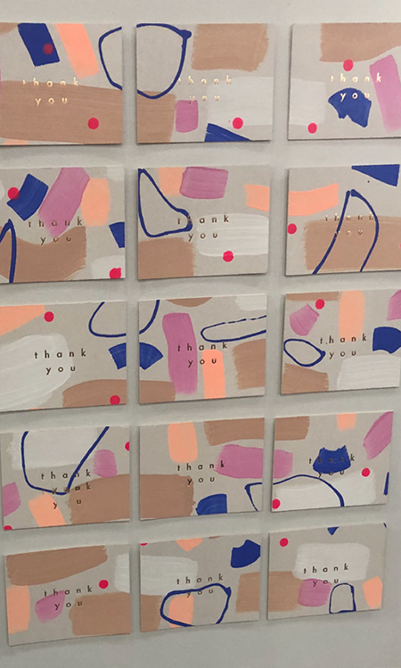
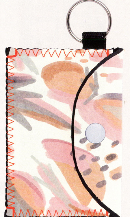
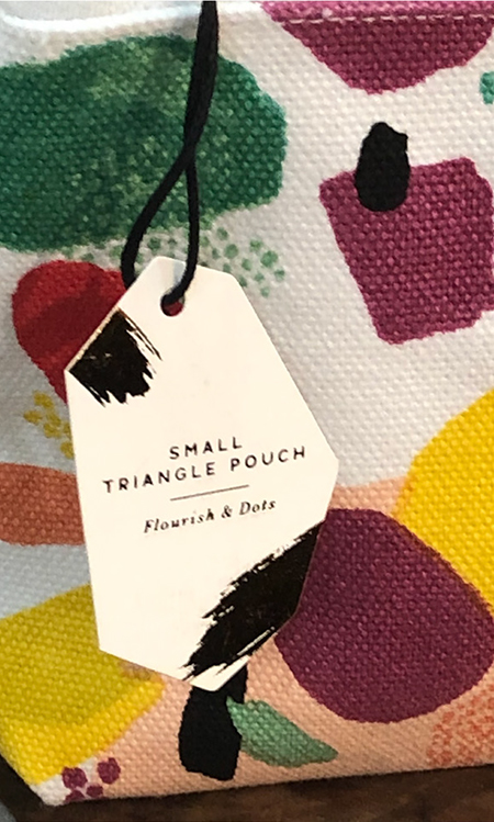
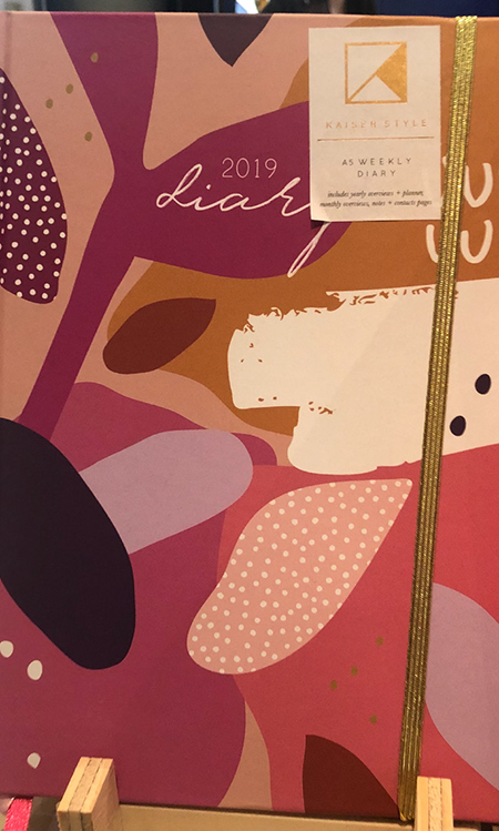
The Abstract trend was shown in a wide array of colors. Most were muted palettes using sage, coral, steely blues, and blush. Smaller items like notebooks, journals, pouches, cards, and gift wrap had a wider variety of colors and with some showing punches of bright accent colors like neons and primary colors.
Shapes within the art included stripes, dots, rectangles, and ellipses in a hand-drawn on painted feel.
Other than at the Minted booth where this trend alone was the primary trend shown, this look was represented among smal land large brands in capsule collections though prominently featured near the front of the booths or in the spotlight as a feature.
萌芽期趨勢:抽象
抽象趨勢呈現為各種各樣的顏色。大部分是柔和的色調,使用鼠尾草色、珊瑚色、鋼鐵藍和臉頰紅。小件產品展現出更豐富的顏色,例如筆記本、日記本、小袋子、卡片和禮品包裝,其中一些突出展現為明亮的重點色調,如霓虹色和三原色。
藝術上的形狀呈現為手繪風格的條紋、圓點、矩形和橢圓。
除了Minted的展位將這一趨勢作為主要趨勢外,這一外觀還出現在大大小小的品牌膠囊系列上,突出地展示在靠近展位前面的位置,或是放在聚光燈下作為特色產品。
TREND INTRODUCTION: ABSTRACT
The Abstract trend was shown almost exclusively on paper and canvas. It was at times hand painted, though mostly screen printed on the materials. Gold foil was used as an accent on paper products sparingly. This is a forward look overall with a smaller, but growing customer base.
In my twenty years in the Home industry. I often see capsule collections appear when one trend is dominating the market, such as Farmhouse, and this trend offers a solution for retailers to capture a wider audience. I am cautious about this trend, though with the rise of the Mid-Century Modern trend I believe this trend will appeal and go hand-in-hand with that customer.
萌芽期趨勢:抽象
抽象趨勢幾乎只出現在紙制品和帆布產品上。有時是手繪的,但大部分是材料上的絲網印刷。在紙制品上使用少量金箔作為重點。總體而言,這是一個前瞻性的外觀,面向更小的、但是上升的客戶基礎。
在我從事家居的20年中,我經常看到膠囊系列出現在一個趨勢正在主導市場的時候,例如農場趨勢,這一趨勢為零售商們提供了吸引更廣泛的客戶群體的方式。我對這一趨勢保持謹慎的態度,但是隨著上世紀中期現代風格的上升,這一趨勢將會吸引客戶,并和客戶攜手并進。

★文章來自《2019紐約國際文具展分析報告》。
★點擊此處,查看更多報告詳情:http://www.27679.cn/report/29.html
與設計師合作
更多該設計師作品詳情,
(轉載請注明出自愛原物,盜版必究)
 愛原物APP


 誠實守信
誠實守信 尊重版權
尊重版權 扎實服務
扎實服務 共同分享
共同分享

 微信公眾號
微信公眾號
 新浪微博
新浪微博